
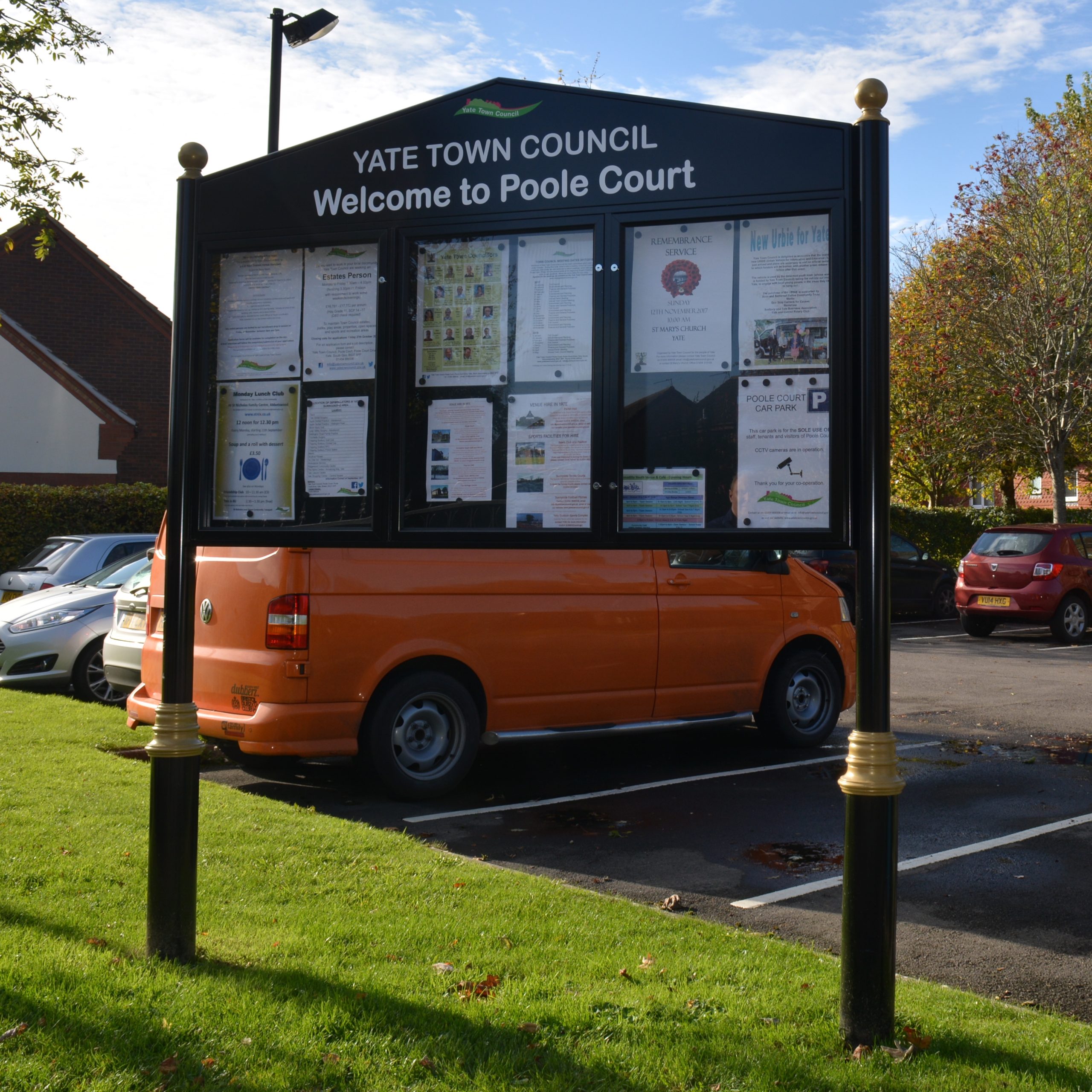
When picturing outdoor information boards, they should bring to mind a super helpful focal point for visitors to public parks and local attractions. They should also help people understand how to use shared spaces.
But what is the essential information a board like this needs? And is there such a thing as too much?
Deciding what deserves space is the first step when planning an outdoor information board. This guide explains what to include, what to leave out and how to organise everything so visitors can find what they need.
Start with the information visitors need most at a public park
Every public park outdoor information board should answer the questions visitors are most likely to have when they arrive, such as a site map, toilets, and a cafe.
This table outlines some of this essential information and what to include:
| Information | What to include |
|---|---|
| Park map | Entrances, paths, landmarks and clear ‘You are here’ markers. |
| Facilities | Toilets, parking, seating, playgrounds and refreshments. |
| Accessibility | Step-free routes, accessible facilities and known obstacles. |
| Park rules | Relevant restrictions, including dogs, opening hours, cycling and barbecues. |
| Emergency details | Park name, location information and emergency access points where appropriate. |
| Contact information | Details for reporting damage, hazards or maintenance issues. |
Make park maps easy to understand
A park map helps visitors make quick decisions without them needing to study every detail. This is where the design and layout of your map become key. Follow these tips:
Show routes and facilities clearly.
- Use recognisable symbols for facilities
- Distinguish between different types of paths
- Include a simple legend and approximate walking times or distances
- Mark the board’s location prominently
- Orient the map to match the direction visitors are facing where practical
Include useful accessibility information
- Clearly mark step-free and wheelchair-accessible routes
- Highlight steps, steep gradients, uneven surfaces and narrow paths
- Identify accessible toilets, parking and other facilities
- Avoid general accessibility claims without specific route information
Use colour and formatting to make the map easy to read
- Establish a clear visual hierarchy for important information
- Use distinct, consistent colours for different routes and areas
- Choose accessible typefaces and text sizes
- Ensure there’s sufficient contrast between text and backgrounds
- Avoid relying on colour alone to communicate information
Give local rules enough prominence on your information board
Visitors need to understand what is expected and where restrictions apply. So park rules should be immediately noticeable on your outdoor information board.
Equally, don’t overwhelm your visitors with endless rules. Keep instructions concise and only explain the requirements that truly affect them.
For example:
- Where dogs must be kept on leads
- If cycling is only permitted on certain paths
- Where barbecues and open fires are prohibited
- Areas of protected wildlife habitats and plants
Use symbols where helpful, but accompany them with clear wording to avoid ambiguity.
Use outdoor information boards to tell the park’s story
Public parks sometimes have history, wildlife, or community conservation projects worth sharing. Many also hold events and community activities. But these details don’t necessarily belong alongside essential visitor information.
Consider using separate boards for different purposes. Keep the main entrance board for practical information, then use separate dedicated displays to help visitors explore the park’s character.
The table below outlines how you could split up helpful visitor information.
| Type of board | Best used for |
|---|---|
| Main information board | Maps, facilities, park rules and emergency information. |
| Interpretation panels | Local history, wildlife habitats, heritage features and conservation projects. |
| Lockable notice boards | Community events, volunteering opportunities and temporary announcements. |
Interpretation panels should be positioned close to the features they explain. This way, visitors can make direct connections between what they’re reading and what they’re seeing.
For information that changes regularly, such as upcoming events or temporary closures, lockable notice boards provide a secure space for displaying notices that park staff can easily update.
Worth considering: QR codes can link to longer stories, audio guides or seasonal wildlife information without overcrowding the display.
Choose a layout and design suitable for the size of your board
Clear organisation, design, and suitable materials are as important as the information itself.
When finalising the design of your outdoor information board, consider:
- Reading order. Make maps and essential information the most prominent.
- Text size. Make headings and important instructions readable from a comfortable viewing distance.
- Contrast. Choose colours that make text distinguishable in changing light.
- Positioning. Allow enough space for a variety of visitors to approach and read the board, including wheelchair and mobility scooter users.
- Durability. Consider extreme weatherproof notice boards for exposed locations and regularly updated displays
Get help choosing the right outdoor information board with Noticeboards Online
The team at Noticeboard Company specialises in interpretation and outdoor display solutions for public spaces. With experience supplying different sizes, materials and mounting options, they can help you find a practical solution for your park.
Reach out to us for advice before ordering, especially if you’re unsure which type of outdoor information board best suits your location.